> ## Documentation Index
> Fetch the complete documentation index at: https://docs.dialai.ca/llms.txt
> Use this file to discover all available pages before exploring further.
# Widget Appearance
> Give a web widget the look of your site with a preset, colour and shape overrides, a font, and a launcher style.
The appearance of a [web widget](/web-widgets) is a **preset** plus your **overrides**. A preset sets the full look. An override changes one value, such as the accent colour or the panel corners. Each value that you do not override comes from the preset.
You set the appearance on the dashboard. The platform stores it with the widget, and each site that shows the widget gets it. The page that shows the widget cannot change the theme at run time.
## Open the appearance editor
Go to **Agent > Points of Contact > Web Widgets** and click the widget.
On the **Appearance** card, click **Customize**. You need the `web-widgets:update` permission.
Select a preset, then change the values on the tabs. The live preview shows each change.
Click **Save**. To discard your changes, click **Cancel**.
When the editor is closed, the **Appearance** card shows a picture of the widget and a summary: **Preset**, **Light or dark**, **Accent**, **Font** and **Launcher**.
## Presets
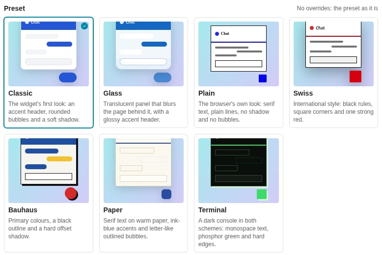
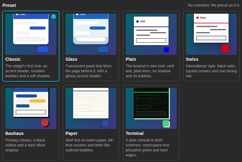
The editor shows the presets in a gallery. Click a preset to select it.
 | Preset | The look |
| - | - |
| **Classic** | The widget's first look: an accent header, rounded bubbles and a soft shadow. This is the default. |
| **Glass** | Translucent panel that blurs the page behind it, with a glossy accent header. |
| **Plain** | The browser's own look: serif text, plain lines, no shadow and no bubbles. |
| **Swiss** | International style: black rules, square corners and one strong red. |
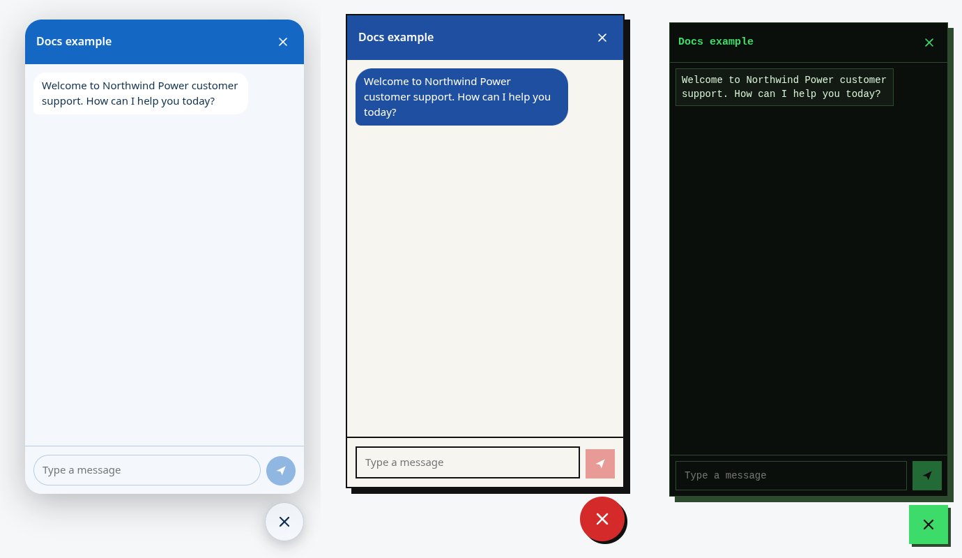
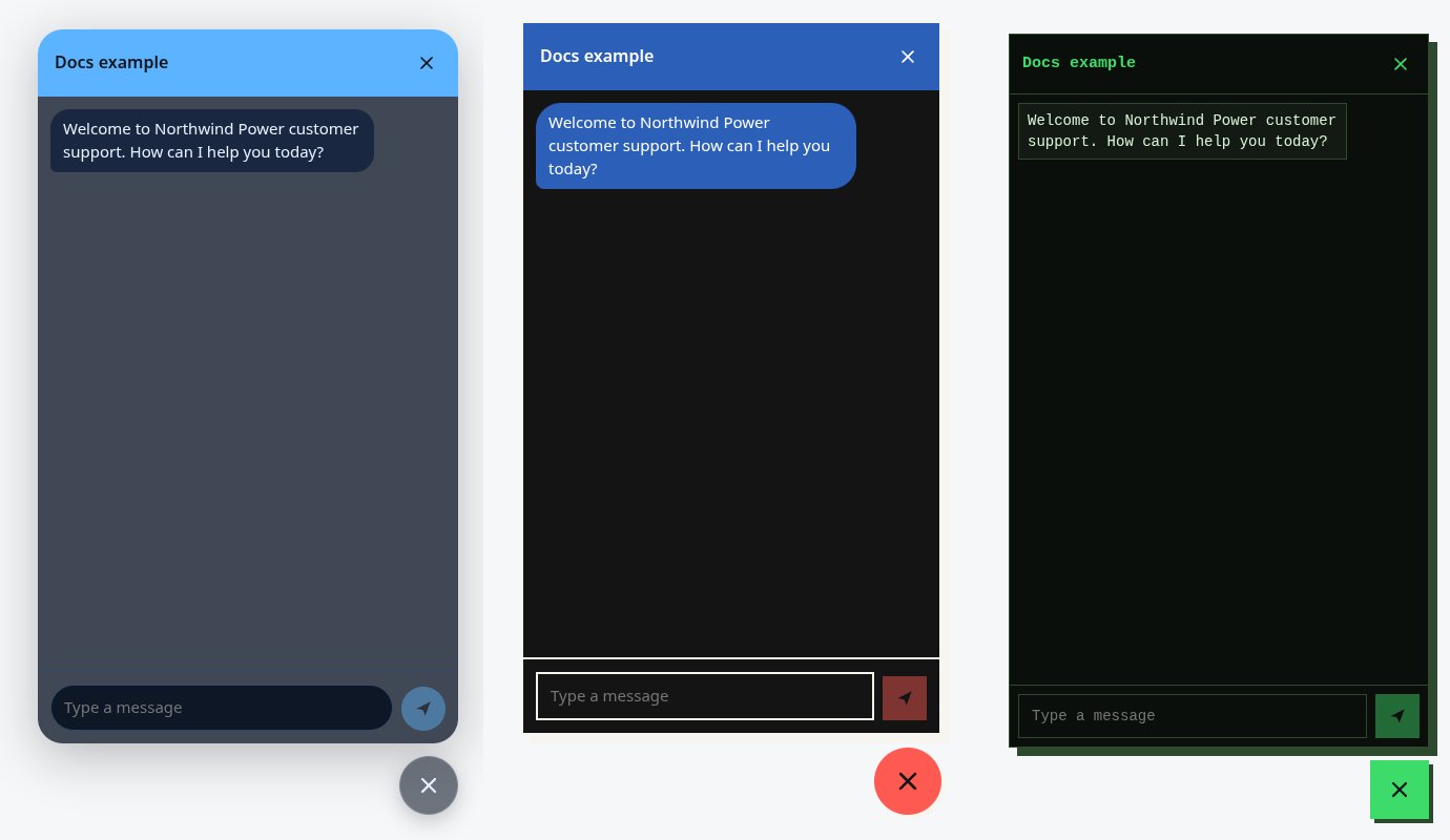
| **Bauhaus** | Primary colours, a black outline and a hard offset shadow. |
| **Paper** | Serif text on warm paper, ink-blue accents and letter-like outlined bubbles. |
| **Terminal** | A dark console in both schemes: monospace text, phosphor green and hard edges. |
Each preset meets the WCAG 2.1 AA contrast ratio (4.5:1) for its text, in light and in dark.
| Preset | The look |
| - | - |
| **Classic** | The widget's first look: an accent header, rounded bubbles and a soft shadow. This is the default. |
| **Glass** | Translucent panel that blurs the page behind it, with a glossy accent header. |
| **Plain** | The browser's own look: serif text, plain lines, no shadow and no bubbles. |
| **Swiss** | International style: black rules, square corners and one strong red. |
| **Bauhaus** | Primary colours, a black outline and a hard offset shadow. |
| **Paper** | Serif text on warm paper, ink-blue accents and letter-like outlined bubbles. |
| **Terminal** | A dark console in both schemes: monospace text, phosphor green and hard edges. |
Each preset meets the WCAG 2.1 AA contrast ratio (4.5:1) for its text, in light and in dark.
 Above the gallery, the editor shows the number of overrides, for example "3 overrides on the preset". Click **Clear overrides** to remove all overrides and use the preset as it is. When you select a different preset, your overrides stay.
## Light or dark
**Light or dark** sets which colour scheme the widget shows:
* **As the visitor's system** — the widget follows the light or dark choice of the visitor's device.
* **Light** — always light.
* **Dark** — always dark.
## Overrides
The overrides are on five tabs: **Colours**, **Shape**, **Type**, **Surface** and **Launcher**.
Each field shows its default value in grey when you do not override it. The hint below the field tells you where the default comes from, such as **From the preset**. To remove an override, click the reset icon beside the field label (tooltip **Use the default**).
### Colours
Above the gallery, the editor shows the number of overrides, for example "3 overrides on the preset". Click **Clear overrides** to remove all overrides and use the preset as it is. When you select a different preset, your overrides stay.
## Light or dark
**Light or dark** sets which colour scheme the widget shows:
* **As the visitor's system** — the widget follows the light or dark choice of the visitor's device.
* **Light** — always light.
* **Dark** — always dark.
## Overrides
The overrides are on five tabs: **Colours**, **Shape**, **Type**, **Surface** and **Launcher**.
Each field shows its default value in grey when you do not override it. The hint below the field tells you where the default comes from, such as **From the preset**. To remove an override, click the reset icon beside the field label (tooltip **Use the default**).
### Colours
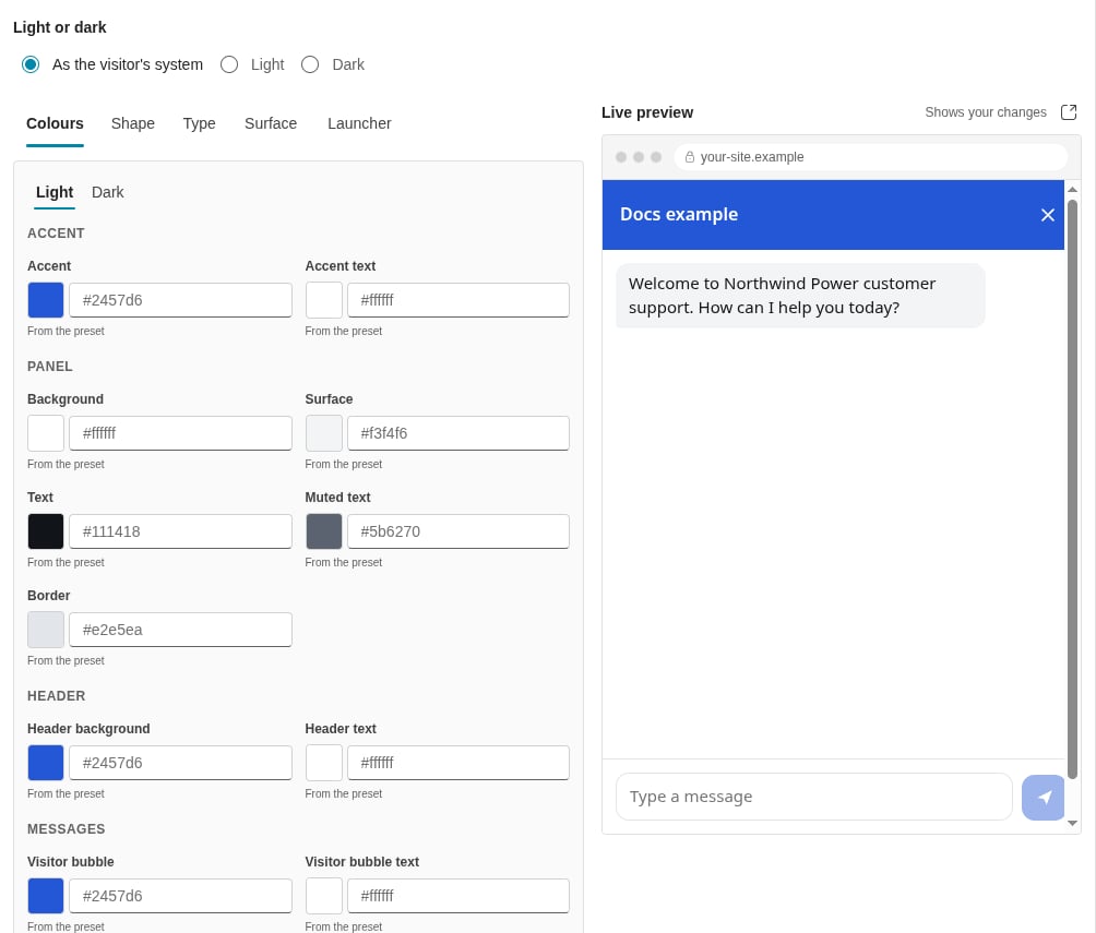
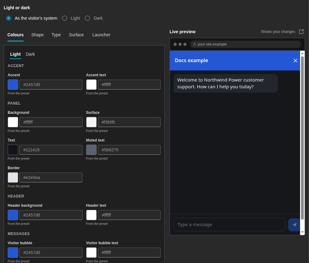 The **Colours** tab has a **Light** tab and a **Dark** tab, because each scheme has its own colours. A scheme that the widget does not show has "(not shown)" after its name.
| Group | Colours |
| - | - |
| **Accent** | **Accent**, **Accent text** |
| **Panel** | **Background**, **Surface**, **Text**, **Muted text**, **Border** |
| **Header** | **Header background**, **Header text** |
| **Messages** | **Visitor bubble**, **Visitor bubble text**, **Agent bubble**, **Agent bubble text** |
Type a colour as `#rrggbb`, or as `#rrggbbaa` for a colour with transparency. You can also click the colour well and pick a colour.
### Where the default colours come from
* **Accent** — the **Primary colour** of your tenant, if your tenant has one. Otherwise, the accent of the preset. You set the **Primary colour** in **Settings > Theme > Brand colours**. See [Theme](/theme-editing#brand-colours).
* **Accent text** — near-black or white, whichever has more contrast on the accent.
* **Header text**, **Visitor bubble text** and **Agent bubble text** — the text colour of the preset. If you override the background of the header or a bubble, its text becomes near-black or white. The platform selects the one with more contrast.
* In some presets, such as **Classic**, the header and the visitor bubbles follow the accent. When you change the accent, they change too.
* All other colours come from the preset.
### Contrast warnings
The editor checks the contrast of each text colour on its background, in light and in dark:
* **Text** on **Background**
* **Muted text** on **Background**
* **Header text** on **Header background**
* **Visitor bubble text** on **Visitor bubble**
* **Agent bubble text** on **Agent bubble**
* **Accent text** on **Accent**
When a pair has a contrast of less than 4.5:1, the **Colours** tab shows a red count. The tab also shows the message "Some text may be hard to read" with a list of the pairs. You can still save, but visitors with low vision can find the text hard to read.
### Shape
| Field | Values |
| - | - |
| **Panel corners** | 0 to 32 px |
| **Message corners** | 0 to 32 px |
| **Button and field corners** | 0 to 32 px |
| **Border width** | 0 to 4 px |
| **Border style** | **Solid**, **Dashed**, **Double** |
### Type
| Field | Values |
| - | - |
| **Font** | See [Fonts](#fonts). |
| **Text size** | 13 to 18 px |
| **Spacing** | **Compact**, **Comfortable** |
### Surface
| Field | Values |
| - | - |
| **Shadow** | **None**, **Soft**, **Strong**, **Hard offset** |
| **Background blur** | 0 to 40 px |
| **Panel opacity** | 0.5 to 1 |
| **Header** | **Filled**, **Plain**, **Underline** |
| **Messages** | **Filled**, **Outlined**, **Plain** |
A **Panel opacity** of less than 1 makes the panel translucent. The panel then blurs the page behind it.
### Launcher
The **Colours** tab has a **Light** tab and a **Dark** tab, because each scheme has its own colours. A scheme that the widget does not show has "(not shown)" after its name.
| Group | Colours |
| - | - |
| **Accent** | **Accent**, **Accent text** |
| **Panel** | **Background**, **Surface**, **Text**, **Muted text**, **Border** |
| **Header** | **Header background**, **Header text** |
| **Messages** | **Visitor bubble**, **Visitor bubble text**, **Agent bubble**, **Agent bubble text** |
Type a colour as `#rrggbb`, or as `#rrggbbaa` for a colour with transparency. You can also click the colour well and pick a colour.
### Where the default colours come from
* **Accent** — the **Primary colour** of your tenant, if your tenant has one. Otherwise, the accent of the preset. You set the **Primary colour** in **Settings > Theme > Brand colours**. See [Theme](/theme-editing#brand-colours).
* **Accent text** — near-black or white, whichever has more contrast on the accent.
* **Header text**, **Visitor bubble text** and **Agent bubble text** — the text colour of the preset. If you override the background of the header or a bubble, its text becomes near-black or white. The platform selects the one with more contrast.
* In some presets, such as **Classic**, the header and the visitor bubbles follow the accent. When you change the accent, they change too.
* All other colours come from the preset.
### Contrast warnings
The editor checks the contrast of each text colour on its background, in light and in dark:
* **Text** on **Background**
* **Muted text** on **Background**
* **Header text** on **Header background**
* **Visitor bubble text** on **Visitor bubble**
* **Agent bubble text** on **Agent bubble**
* **Accent text** on **Accent**
When a pair has a contrast of less than 4.5:1, the **Colours** tab shows a red count. The tab also shows the message "Some text may be hard to read" with a list of the pairs. You can still save, but visitors with low vision can find the text hard to read.
### Shape
| Field | Values |
| - | - |
| **Panel corners** | 0 to 32 px |
| **Message corners** | 0 to 32 px |
| **Button and field corners** | 0 to 32 px |
| **Border width** | 0 to 4 px |
| **Border style** | **Solid**, **Dashed**, **Double** |
### Type
| Field | Values |
| - | - |
| **Font** | See [Fonts](#fonts). |
| **Text size** | 13 to 18 px |
| **Spacing** | **Compact**, **Comfortable** |
### Surface
| Field | Values |
| - | - |
| **Shadow** | **None**, **Soft**, **Strong**, **Hard offset** |
| **Background blur** | 0 to 40 px |
| **Panel opacity** | 0.5 to 1 |
| **Header** | **Filled**, **Plain**, **Underline** |
| **Messages** | **Filled**, **Outlined**, **Plain** |
A **Panel opacity** of less than 1 makes the panel translucent. The panel then blurs the page behind it.
### Launcher
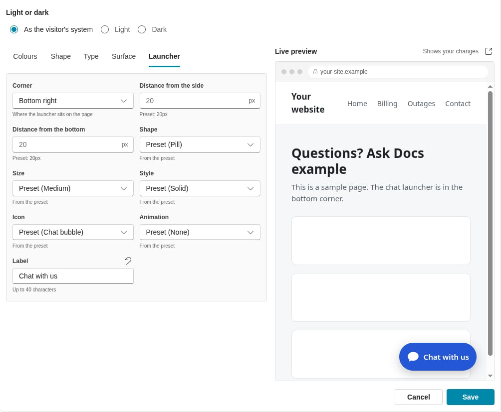
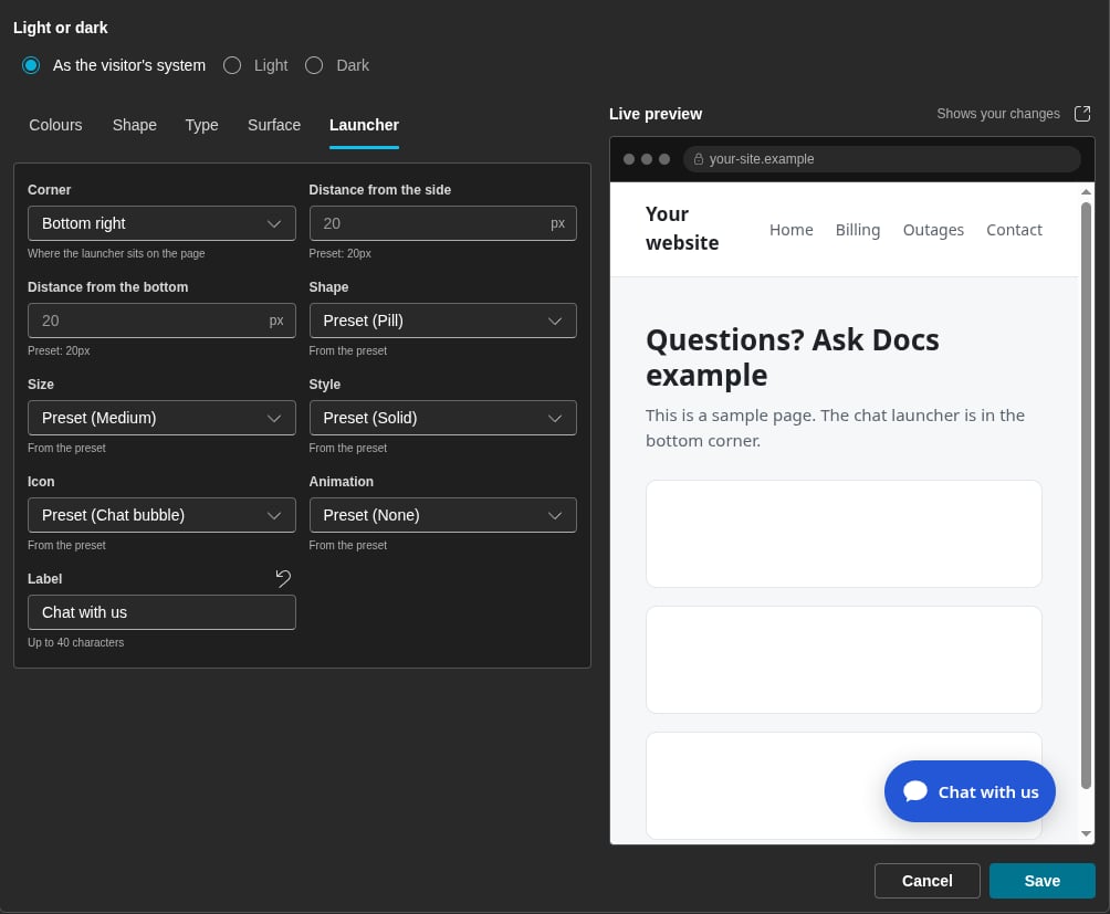 | Field | Values |
| - | - |
| **Corner** | **Bottom right**, **Bottom left** |
| **Distance from the side** | 0 to 64 px |
| **Distance from the bottom** | 0 to 64 px |
| **Shape** | **Circle**, **Pill**, **Square**, **Rounded** |
| **Size** | **Small** (48 px), **Medium** (56 px), **Large** (64 px) |
| **Style** | **Solid**; **Glass**, which blurs the page behind it; **Orb**, a sphere in the accent colour that turns |
| **Icon** | **Chat bubble**, **Spark**, **No icon** |
| **Animation** | **None**, **Pulse**, **Orbit** |
| **Label** | A short text beside the icon. Leave it empty to show the icon only. |
A **Circle** launcher shows no label. If you set **No icon** and no label, the launcher shows the chat bubble icon. The **Orb** style and the animations stop when the visitor's device asks for reduced motion.
## Fonts
On the **Type** tab, select the kind of font in **Font**:
| Kind | What it does |
| - | - |
| **The preset's font** | The system font of the preset. Nothing loads. This is the default. |
| **A system font stack** | A font that each device has. Select the **Stack**: **Sans serif**, **Serif**, **Monospace** or **Rounded**. Nothing loads. |
| **Fonts on the visitor's device** | Type **Font names**, separated by commas, such as `"Segoe UI", Arial`. The widget uses a font only when the visitor's device has it. |
| **A web font stylesheet** | A CSS file that loads a web font, such as a Google Fonts stylesheet. Type the **Family name** and the **Stylesheet URL**. |
| **Font files** | Your own font files. Type the **Family name**, then add a **Font file URL**, a **Weight** and a **Style** for each file. |
### Web font stylesheet
Example of a **Stylesheet URL**:
```text theme={null}
https://fonts.googleapis.com/css2?family=Inter:wght@400;600&display=swap
```
The **Family name** for this example is `Inter`.
| Field | Values |
| - | - |
| **Corner** | **Bottom right**, **Bottom left** |
| **Distance from the side** | 0 to 64 px |
| **Distance from the bottom** | 0 to 64 px |
| **Shape** | **Circle**, **Pill**, **Square**, **Rounded** |
| **Size** | **Small** (48 px), **Medium** (56 px), **Large** (64 px) |
| **Style** | **Solid**; **Glass**, which blurs the page behind it; **Orb**, a sphere in the accent colour that turns |
| **Icon** | **Chat bubble**, **Spark**, **No icon** |
| **Animation** | **None**, **Pulse**, **Orbit** |
| **Label** | A short text beside the icon. Leave it empty to show the icon only. |
A **Circle** launcher shows no label. If you set **No icon** and no label, the launcher shows the chat bubble icon. The **Orb** style and the animations stop when the visitor's device asks for reduced motion.
## Fonts
On the **Type** tab, select the kind of font in **Font**:
| Kind | What it does |
| - | - |
| **The preset's font** | The system font of the preset. Nothing loads. This is the default. |
| **A system font stack** | A font that each device has. Select the **Stack**: **Sans serif**, **Serif**, **Monospace** or **Rounded**. Nothing loads. |
| **Fonts on the visitor's device** | Type **Font names**, separated by commas, such as `"Segoe UI", Arial`. The widget uses a font only when the visitor's device has it. |
| **A web font stylesheet** | A CSS file that loads a web font, such as a Google Fonts stylesheet. Type the **Family name** and the **Stylesheet URL**. |
| **Font files** | Your own font files. Type the **Family name**, then add a **Font file URL**, a **Weight** and a **Style** for each file. |
### Web font stylesheet
Example of a **Stylesheet URL**:
```text theme={null}
https://fonts.googleapis.com/css2?family=Inter:wght@400;600&display=swap
```
The **Family name** for this example is `Inter`.
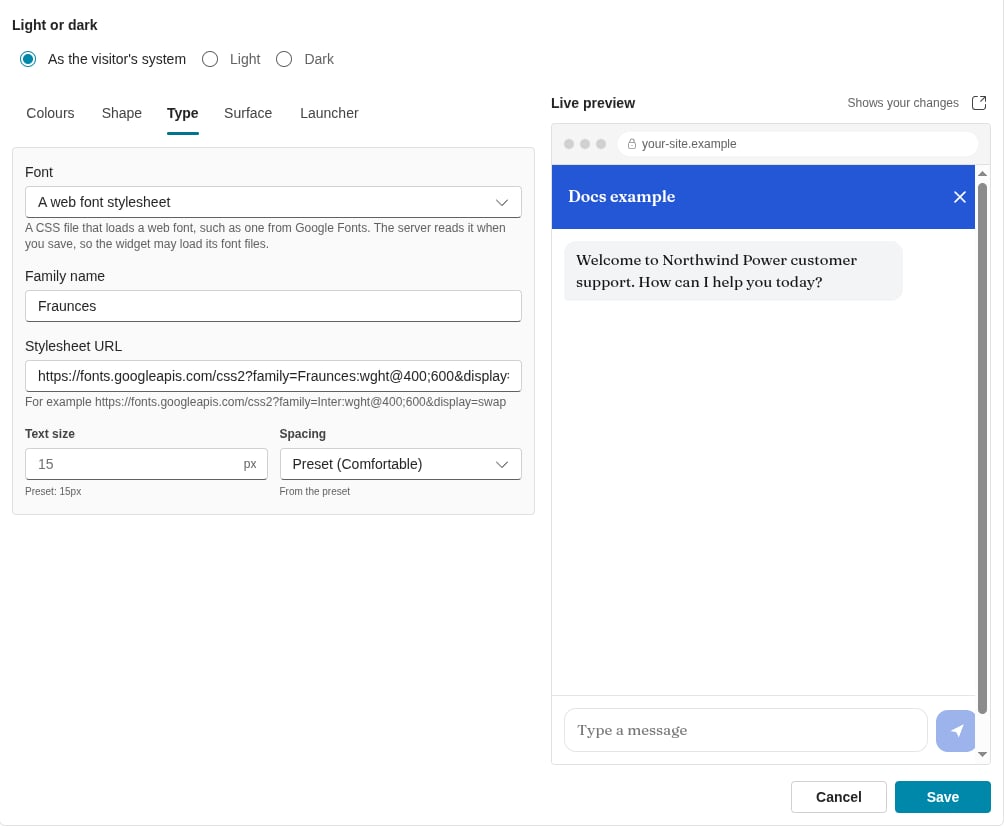
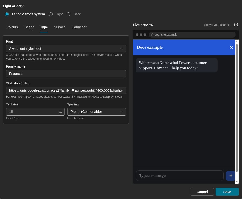 When you save, the server reads the stylesheet. It finds the hosts of the font files in the stylesheet. The widget then lets the chat panel load fonts only from the stylesheet host and these font hosts. The stylesheet must obey these rules:
* The URL starts with `https://` and names a public host.
* The server gets an answer of type `text/css`.
* The stylesheet names at least one font file on a public `https` host.
* The font files are on a maximum of 8 hosts.
If the server cannot use the stylesheet, the field shows "The server cannot use this stylesheet." and the reason. The **Type** tab then shows a warning icon.
### Font files
Each font file must be `woff2`, `woff`, `ttf` or `otf`, with an `https` URL on a public host. Add one file for each weight and style that you need, to a maximum of 8 files. Example: `https://cdn.example.com/brand-400.woff2`.
The launcher is on your own page, and the widget does not load a font into your page. The launcher uses the family name of the theme font. If your page does not load that font, the launcher shows the system font.
## Live preview
While the editor is open, the **Live preview** shows the sample site beside the controls, with your unsaved changes. The preview changes a short time after each change.
The **Open the sample site in a new tab** icon button opens the preview in a new browser tab. There, the widget has the full window. The tab shows your unsaved changes. When you make more changes, the tab shows **The theme has changed.** and a **Reload** button.
The tab can show these messages:
| Message | What it means |
| - | - |
| The theme has changed. | Click **Reload** to see the latest version. |
| The editor is closed, so there is no draft. Reload shows the saved theme. | You saved or cancelled the edit. |
| The preview expires soon. / The preview has expired. | A preview lasts 10 minutes. Click **Reload** to make a new one. |
| No draft is open, so this tab shows the saved theme. | The tab shows the saved appearance. |
## Save
Click **Save** to store the appearance. Each site gets the new appearance:
* A page that a visitor opens after the save shows the new look.
* A page that stays open shows the new launcher after a maximum of 30 minutes.
If another person saves the appearance while you edit it, a bar asks which version to keep. Click **Use theirs** or **Keep mine**.
## Style the launcher from your page
The launcher and the panel frame are in a closed shadow root, so the CSS of your page cannot reach them. Your page can style these parts with the `::part()` selector on the element `[data-dialai-widget]`:
| Part | What it is |
| - | - |
| `launcher` | The launcher button. |
| `launcher-icon` | The icon in the launcher. |
| `launcher-label` | The label in the launcher. |
| `badge` | The count of unread messages. |
| `panel` | The panel that holds the chat. |
| `panel-close` | The close button of the panel, before the chat loads. |
These part names do not change. Example:
```css theme={null}
[data-dialai-widget]::part(launcher) {
box-shadow: 0 0 0 3px #ffd400;
}
[data-dialai-widget]::part(launcher-label) {
letter-spacing: 0.04em;
}
```
The chat itself is in an iframe on a different origin. No CSS of your page reaches it, and the host page has no theme option. Only the appearance that you save on the dashboard changes the chat.
## Best practices
| Practice | Reason |
| - | - |
| Start from the preset that is nearest to your site. | You need fewer overrides. |
| Set the **Primary colour** of your tenant before you override the accent. | All widgets then use your brand colour. |
| Correct each contrast warning before you save. | Some visitors cannot read text with low contrast. |
| Use **As the visitor's system** when your site has a dark mode. | The widget then follows the visitor's choice. |
## Related
Create a widget and put it on your site.
Tell the widget who your customer is.
Tenant logos and brand colours.
This documentation is built and hosted on [Mintlify](https://mintlify.com), a developer documentation platform.
When you save, the server reads the stylesheet. It finds the hosts of the font files in the stylesheet. The widget then lets the chat panel load fonts only from the stylesheet host and these font hosts. The stylesheet must obey these rules:
* The URL starts with `https://` and names a public host.
* The server gets an answer of type `text/css`.
* The stylesheet names at least one font file on a public `https` host.
* The font files are on a maximum of 8 hosts.
If the server cannot use the stylesheet, the field shows "The server cannot use this stylesheet." and the reason. The **Type** tab then shows a warning icon.
### Font files
Each font file must be `woff2`, `woff`, `ttf` or `otf`, with an `https` URL on a public host. Add one file for each weight and style that you need, to a maximum of 8 files. Example: `https://cdn.example.com/brand-400.woff2`.
The launcher is on your own page, and the widget does not load a font into your page. The launcher uses the family name of the theme font. If your page does not load that font, the launcher shows the system font.
## Live preview
While the editor is open, the **Live preview** shows the sample site beside the controls, with your unsaved changes. The preview changes a short time after each change.
The **Open the sample site in a new tab** icon button opens the preview in a new browser tab. There, the widget has the full window. The tab shows your unsaved changes. When you make more changes, the tab shows **The theme has changed.** and a **Reload** button.
The tab can show these messages:
| Message | What it means |
| - | - |
| The theme has changed. | Click **Reload** to see the latest version. |
| The editor is closed, so there is no draft. Reload shows the saved theme. | You saved or cancelled the edit. |
| The preview expires soon. / The preview has expired. | A preview lasts 10 minutes. Click **Reload** to make a new one. |
| No draft is open, so this tab shows the saved theme. | The tab shows the saved appearance. |
## Save
Click **Save** to store the appearance. Each site gets the new appearance:
* A page that a visitor opens after the save shows the new look.
* A page that stays open shows the new launcher after a maximum of 30 minutes.
If another person saves the appearance while you edit it, a bar asks which version to keep. Click **Use theirs** or **Keep mine**.
## Style the launcher from your page
The launcher and the panel frame are in a closed shadow root, so the CSS of your page cannot reach them. Your page can style these parts with the `::part()` selector on the element `[data-dialai-widget]`:
| Part | What it is |
| - | - |
| `launcher` | The launcher button. |
| `launcher-icon` | The icon in the launcher. |
| `launcher-label` | The label in the launcher. |
| `badge` | The count of unread messages. |
| `panel` | The panel that holds the chat. |
| `panel-close` | The close button of the panel, before the chat loads. |
These part names do not change. Example:
```css theme={null}
[data-dialai-widget]::part(launcher) {
box-shadow: 0 0 0 3px #ffd400;
}
[data-dialai-widget]::part(launcher-label) {
letter-spacing: 0.04em;
}
```
The chat itself is in an iframe on a different origin. No CSS of your page reaches it, and the host page has no theme option. Only the appearance that you save on the dashboard changes the chat.
## Best practices
| Practice | Reason |
| - | - |
| Start from the preset that is nearest to your site. | You need fewer overrides. |
| Set the **Primary colour** of your tenant before you override the accent. | All widgets then use your brand colour. |
| Correct each contrast warning before you save. | Some visitors cannot read text with low contrast. |
| Use **As the visitor's system** when your site has a dark mode. | The widget then follows the visitor's choice. |
## Related
Create a widget and put it on your site.
Tell the widget who your customer is.
Tenant logos and brand colours.
This documentation is built and hosted on [Mintlify](https://mintlify.com), a developer documentation platform.