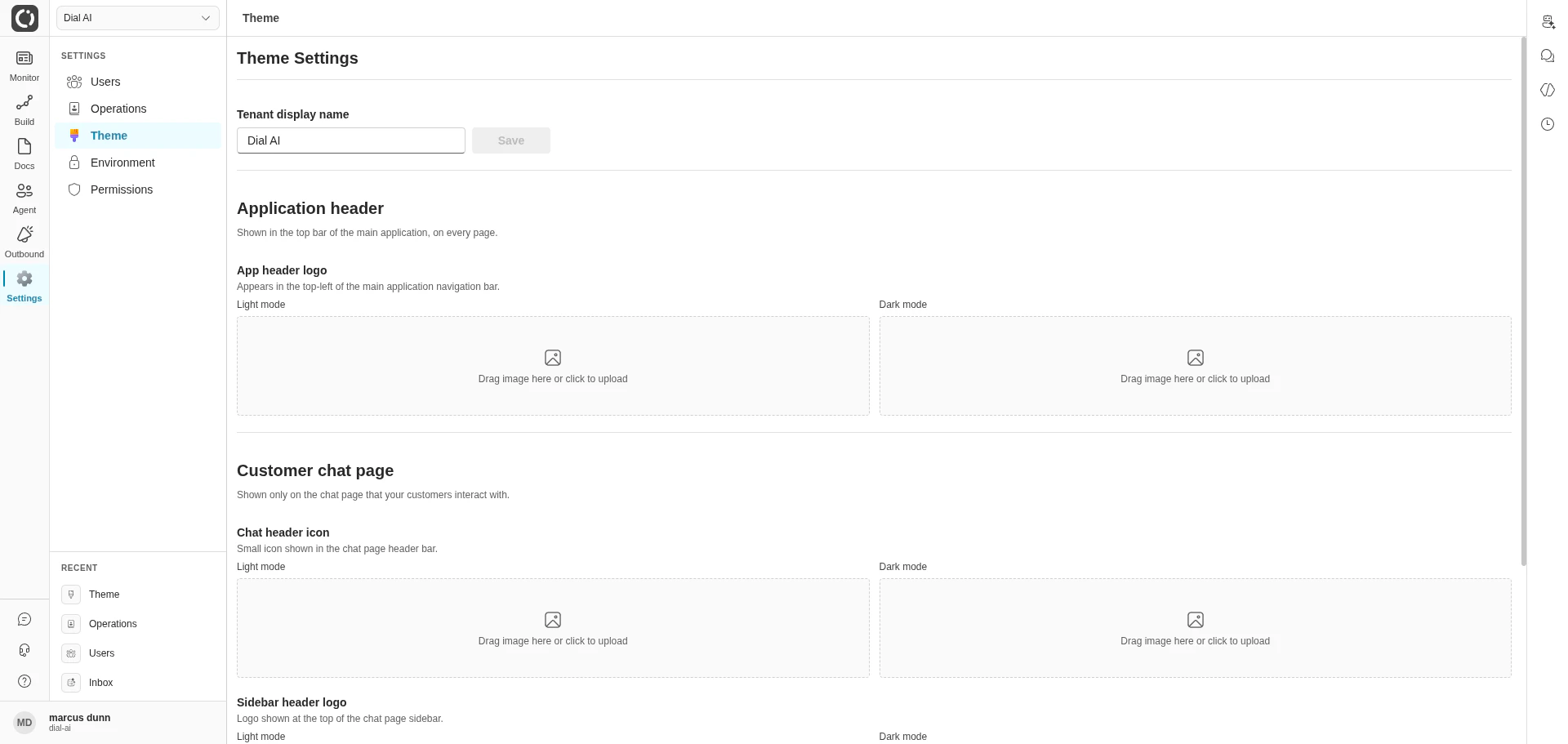
Theme Settings — the tenant branding page
Accessing Theme
Navigate to Settings > Theme in the left sidebar.Tenant display name
The Tenant display name field at the top of the page sets the name shown in the browser title bar, the tenant switcher, and any place the product references the tenant by name.1
Edit the field
Type the new display name.
2
Save
The Save button enables once the value changes.
Logos
Every logo slot accepts a separate Light mode and Dark mode image, so your branding matches whichever theme the viewer has selected. Click the Upload button under each slot to pick a file (PNG or JPEG, up to 2 MB).Application header
The logo shown in the top-left of the platform’s main navigation bar — visible on every page after sign-in.Customer chat page
Two surfaces, both shown on the chat page that end customers interact with (not the operator UI):- Chat header icon — small icon shown in the chat page’s header bar.
- Sidebar header logo — full logo shown at the top of the chat page sidebar.
Handoff icons
When a flow hands a conversation off to another destination (a queue, an external integration, a human agent group), the destination appears in the Conversations table under the Status column. The Handoff icons section lets you customize the icon shown for each destination.Only handoff destinations that have already appeared in real transcripts can be customized — the platform discovers destinations from transcript history. If you don’t see a destination listed, drive a conversation that hands off to it first, then return here.
Color palette (Brand)
The brand palette drives primary buttons, chat bubbles, link colors, and selected branded UI elements. It is a 16-step ramp from10 (darkest) to 160 (lightest), with 80 representing the primary brand color.
Example palette
Generating a palette
A practical way to build a coordinated palette from a new primary color is to provide an example like the one above to an LLM along with your new80 value and ask for a matching ramp.
Applying a palette
Themes are applied per tenant via the API:Advanced — per-mode overrides
To override individual variables for light and dark mode separately, prefix the key withlight- or dark-:
Commonly tuned variables
Related
Environment
Manage tenant-wide environment variables and secrets.
Users
Onboard operators who will see this branding.
Points of Contact: Web
The customer-facing chat surface the logos appear on.