Open the appearance editor
1
Open the widget
Go to Agent > Points of Contact > Web Widgets and click the widget.
2
Open the editor
On the Appearance card, click Customize. You need the
web-widgets:update permission.3
Change the look
Select a preset, then change the values on the tabs. The live preview shows each change.
4
Save
Click Save. To discard your changes, click Cancel.
Presets
The editor shows the presets in a gallery. Click a preset to select it.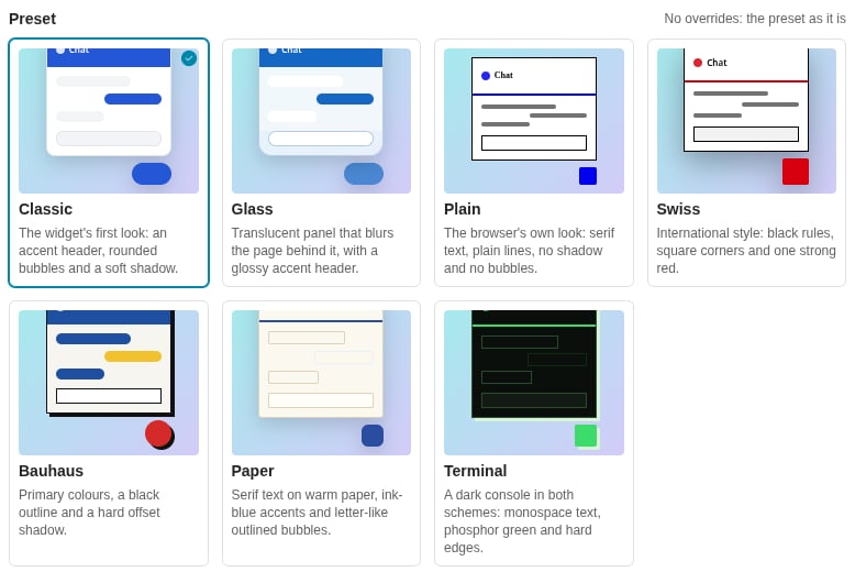
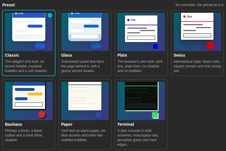
The preset gallery in the appearance editor
Each preset meets the WCAG 2.1 AA contrast ratio (4.5:1) for its text, in light and in dark.
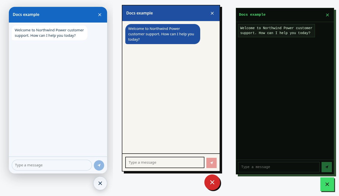
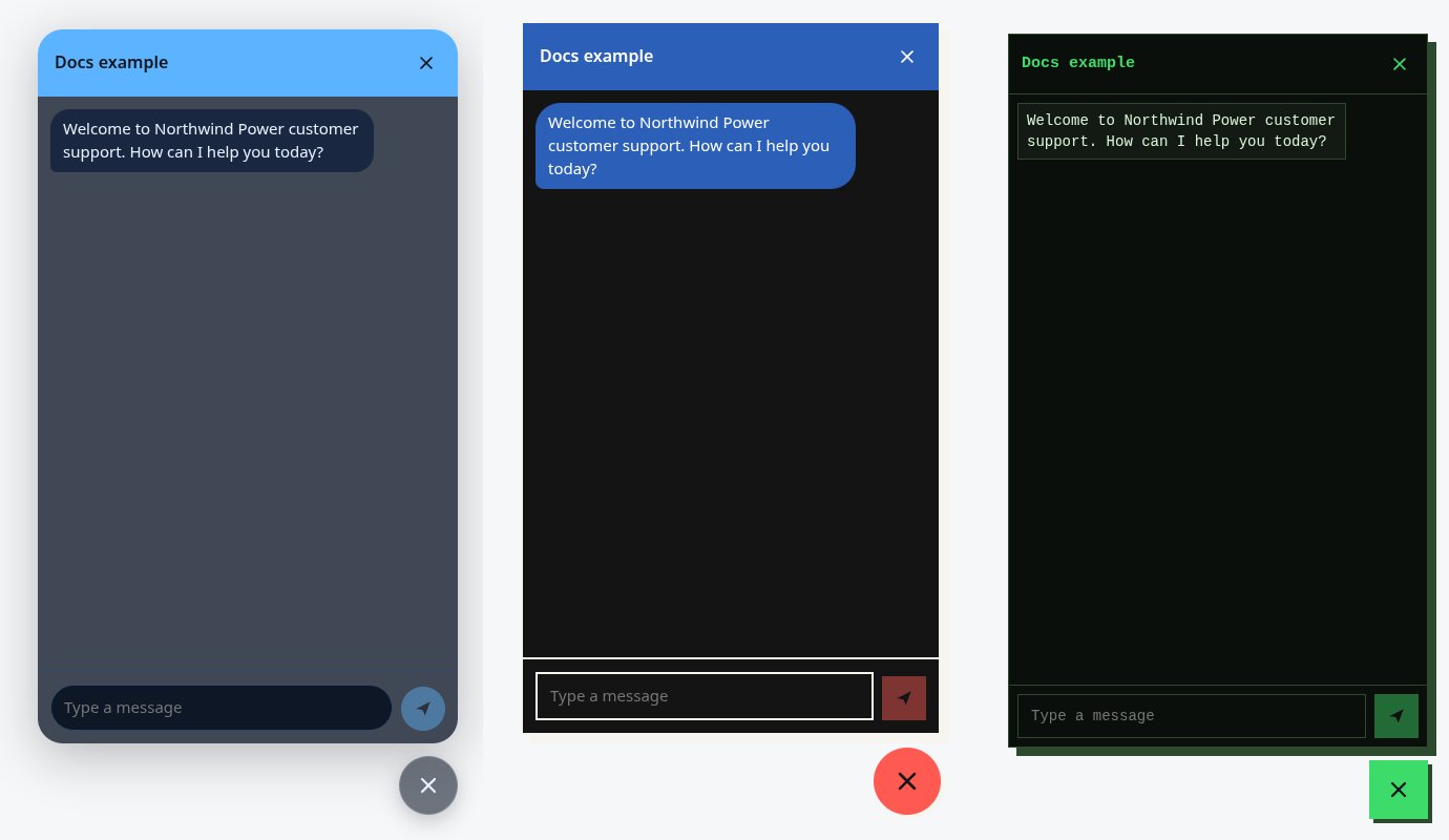
Three presets in the full-window sample tab: Glass, Bauhaus and Terminal
Light or dark
Light or dark sets which colour scheme the widget shows:- As the visitor’s system — the widget follows the light or dark choice of the visitor’s device.
- Light — always light.
- Dark — always dark.
Overrides
The overrides are on five tabs: Colours, Shape, Type, Surface and Launcher. Each field shows its default value in grey when you do not override it. The hint below the field tells you where the default comes from, such as From the preset. To remove an override, click the reset icon beside the field label (tooltip Use the default).Colours
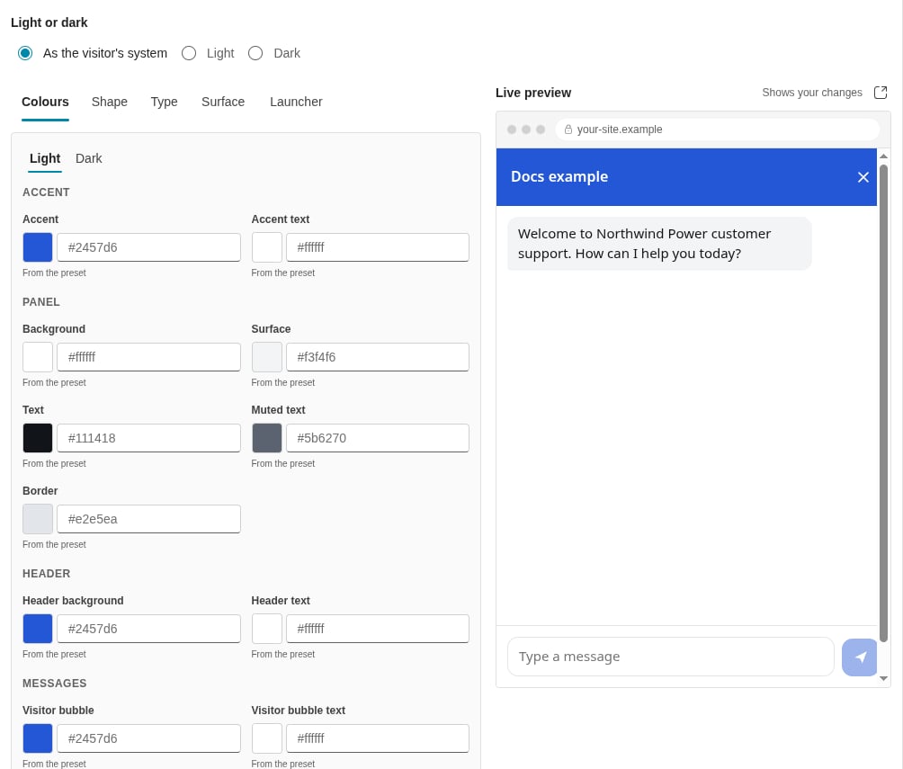
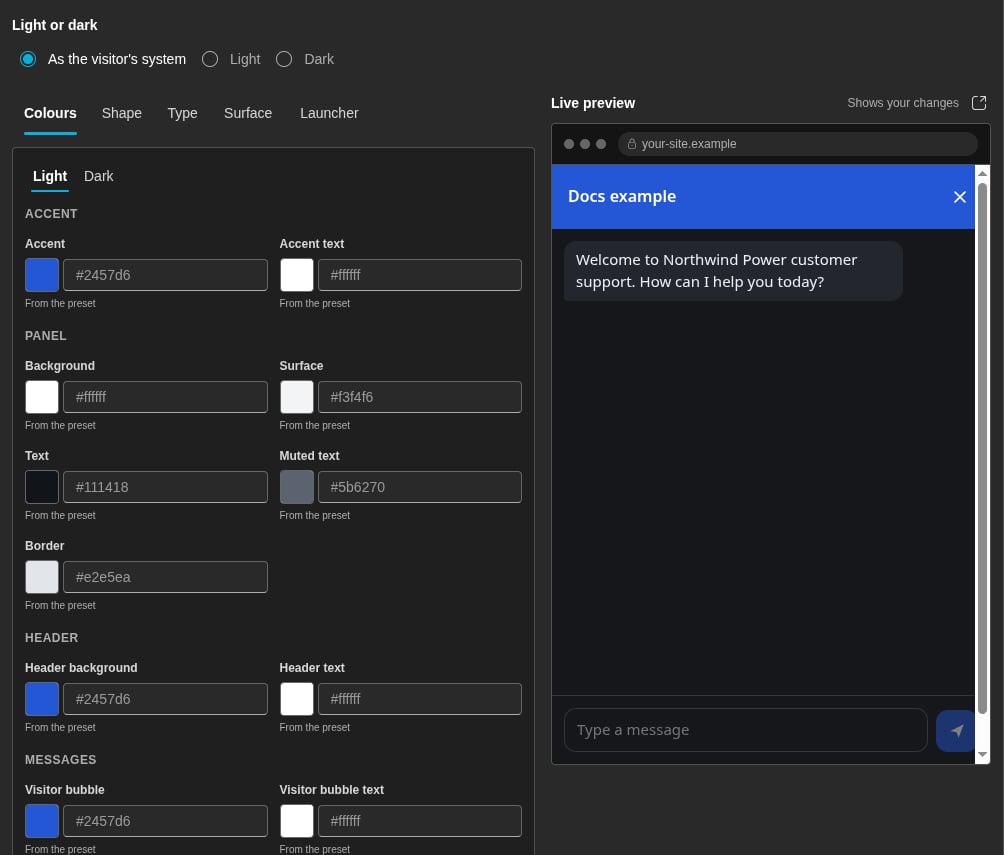
The Colours tab, with the live preview beside it
Type a colour as
#rrggbb, or as #rrggbbaa for a colour with transparency. You can also click the colour well and pick a colour.
Where the default colours come from
- Accent — the Primary colour of your tenant, if your tenant has one. Otherwise, the accent of the preset. You set the Primary colour in Settings > Theme > Brand colours. See Theme.
- Accent text — near-black or white, whichever has more contrast on the accent.
- Header text, Visitor bubble text and Agent bubble text — the text colour of the preset. If you override the background of the header or a bubble, its text becomes near-black or white, whichever has more contrast.
- In some presets, such as Classic, the header and the visitor bubbles follow the accent. When you change the accent, they change too.
- All other colours come from the preset.
Contrast warnings
The editor checks the contrast of each text colour on its background, in light and in dark:- Text on Background
- Muted text on Background
- Header text on Header background
- Visitor bubble text on Visitor bubble
- Agent bubble text on Agent bubble
- Accent text on Accent
Shape
Type
Surface
A Panel opacity of less than 1 makes the panel translucent. The panel then blurs the page behind it.
Launcher
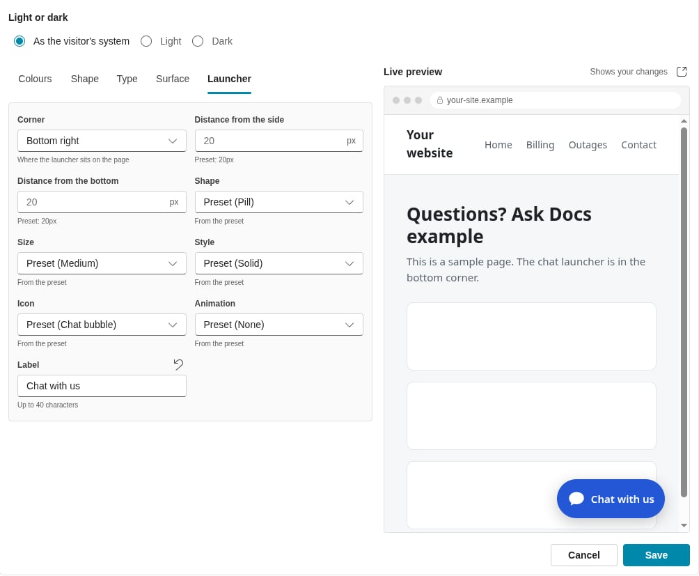
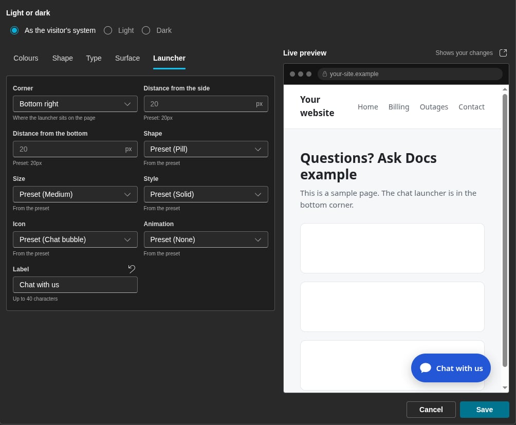
The Launcher tab. The live preview shows a launcher with a label.
A Circle launcher shows no label. If you set No icon and no label, the launcher shows the chat bubble icon. The Orb style and the animations stop when the visitor’s device asks for reduced motion.
Fonts
On the Type tab, select the kind of font in Font:Web font stylesheet
Example of a Stylesheet URL:Inter.
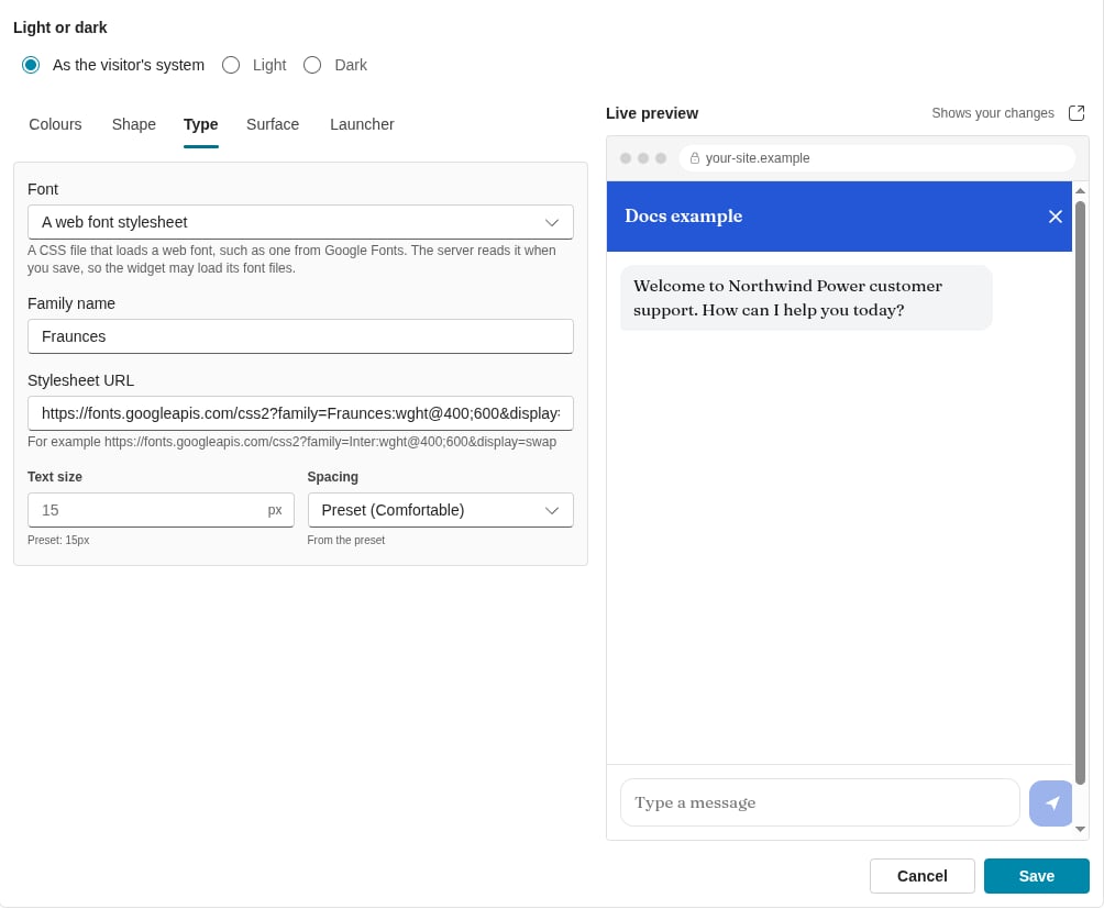
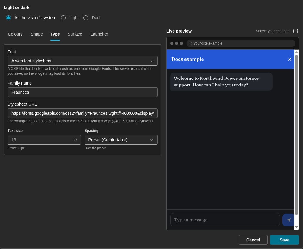
The Type tab with a Google Fonts stylesheet for the Fraunces font
- The URL starts with
https://and names a public host. - The URL answers with the content type
text/css. - The stylesheet names at least one font file on a public
httpshost. - The font files are on a maximum of 8 hosts.
Font files
Each font file must bewoff2, woff, ttf or otf, with an https URL on a public host. Add one file for each weight and style that you need, to a maximum of 8 files. Example: https://cdn.example.com/brand-400.woff2.
The launcher is on your own page, and it uses the family name of the theme font. If your page does not load that font, the launcher shows the system font.
Live preview
While the editor is open, the Live preview shows the sample site beside the controls, with your unsaved changes. The preview changes a short time after each change. The Open the sample site in a new tab icon button opens the preview in a new browser tab. There, the widget has the full window. The tab shows your unsaved changes, but it does not show your later changes until you click Reload. The tab can show these messages:Save
Click Save to store the appearance. Each site gets the new appearance:- A page that a visitor opens after the save shows the new look.
- A page that stays open shows the new launcher after a maximum of 30 minutes.
Style the launcher from your page
The usual CSS of your page does not reach the launcher or the panel frame. Your page can style these parts only with the::part() selector on the element [data-dialai-widget]:
These part names do not change. Example:
Best practices
Related
Web Widgets
Create a widget and put it on your site.
Signed-in visitors
Tell the widget who your customer is.
Theme
Tenant logos and brand colours.